Workspace Activity Heatmaps: See When Your Agents Actually Work
Trend lines are good at telling you whether activity is going up or down. They're bad at telling you when — whether your agent is grinding through tasks at 2am, whether your team's real working hours are 10am–4pm on weekdays, or whether last Tuesday was unusually quiet for a reason worth investigating. That shape of question needs a calendar, not a line chart.
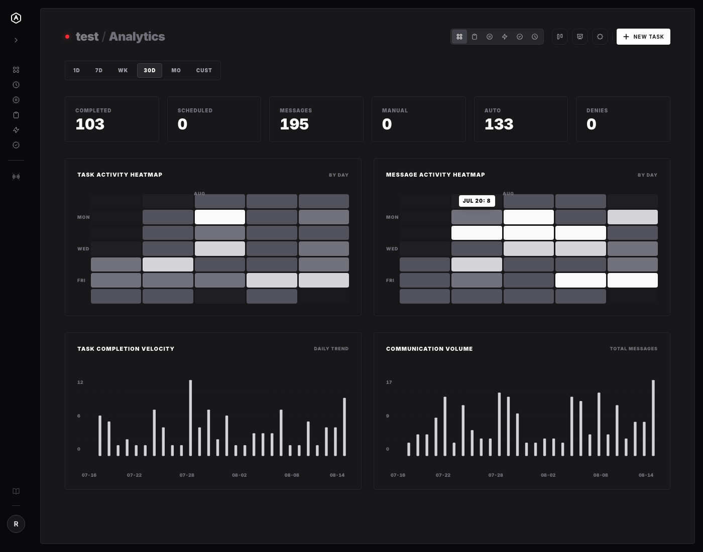
AgentRQ's workspace Analytics page now has one: a pair of GitHub-style contribution heatmaps, sitting right above the existing trend charts.
Two Heatmaps, One Page
There are two grids, tracking the two things that best describe whether a workspace is actually active:
- → Task Activity Heatmap — when tasks get completed
- → Message Activity Heatmap — when messages get sent, between you and your agents
Both live on the same Analytics view as the existing Task Completion Velocity and Communication Volume trend charts, and respond to the same time-range presets — 1D, 7D, WK, 30D, MO, or a custom range.
The Grid Adapts to the Window
Rather than forcing one fixed granularity, the heatmap changes shape depending on how wide a window you're looking at:
- → 7 days or less (
1D,7D, and theWKpreset): an hour × day grid — 24 rows for hours of the day, one column per day. TheWKpreset labels columns with weekday names instead of dates, so a single week reads like an actual calendar week. - → Longer than 7 days (
30D,MO, custom ranges): a day × week grid — the familiar GitHub contribution-graph layout, with week columns and Sun–Sat rows, month labels marking the first column of each new month.
Hovering any cell shows an exact tooltip — JUL 20: 8 for a day-granularity cell, right down to the hour for the finer view — rendered via a teleported element so it's never clipped by a surrounding card, no matter where the cell sits in the grid.
Cell intensity is relative to the busiest cell currently in view (five shading levels, from empty to darkest), so the heatmap stays readable whether a workspace produces 3 events a day or 300.
What Changed Underneath
On the backend, GetDetailedWorkspaceStats now buckets Telemetry rows by hour or by day (switching automatically at the 7-day threshold) and returns the resolved rangeStart/rangeEnd alongside the counts. The week and month presets were also tightened up to always span a full calendar window — Monday through Sunday, the 1st through the last day of the month — instead of stopping abruptly at the current moment, so a heatmap viewed on a Wednesday doesn't just trail off mid-week.
On the frontend, the grid itself (HeatmapChart.vue) is plain CSS — no charting library — which keeps it consistent with the rest of AgentRQ's flat, monochrome design system in both light and dark mode.
Why This Is Worth Having
A number telling you "42 tasks completed this month" doesn't tell you much on its own. A grid showing you that those 42 tasks cluster into two dense weekday bursts with a quiet weekend in between — or, alternatively, that they're spread evenly across every night at 11pm — tells you something real about how your agents (and your team) are actually operating. That's the kind of pattern a line chart smooths away and a calendar heatmap makes obvious at a glance.
---
AgentRQ is currently in public beta. Join our GitHub community to help shape the future of human-agent collaboration.